

WOW. There are TONS of YA books releasing this week, and it looks like almost all of them are releasing on Tuesday. Hopefully we have all been saving up money in order to pick up some of these new releases! It looks like we are making the transition into fall with covers as well. Gone are most of those summery, bright-colored covers. Looks like they are being replaced with darker images. I'm digging it. Happy reading!
1. How to Fall by Jane Casey - August 26
Jess Tennant #1

Thoughts: This cover is okay, I guess. I am assuming that it is a contemporary, but I like that the cover tells us that it might hold some darker qualities and story lines (I will be disappointed if this does not end up being the case...). I don't really like the shape her coat (?) is making, it doesn't seem like a natural movement based on how she is running.
2. The Island of Excess Love by Francesca Lia Block - August 26
Love in the Time of Global Warming #2

Thoughts: I am loving this. I have already mentioned that I am a fan of illustrated covers because I'm getting tired of cover models. I like the silhouettes of the people, but also love the feathers and ship that just melts together into a wonderful image. I'm also a fan of the pink background, and it definitely matches the cover of book one.
3. Bombay Blues by Tanuja Desai Hidier - August 26
Born Confused #2

Thoughts: It definitely gives the reader an idea of what the book is going to be about. I guess I understand the use of all the blue based on the title, too. I am not a fan of how it is split up and has a real model and then an illustrated bottom without any cohesive tie. I feel like this could have been done really, really well...and it just didn't happen.
4. If You're Reading This by Trent Reedy - August 26

Thoughts: Alright...I guess. I'm really starting to dislike how they just merge images into the background (like in the sky here), like that's something that makes sense. Maybe I'm being too picky or literal, but it's not something that I appreciate. It could be two nice separate covers, but not one together like this.
5. Can't Look Away by Donna Cooner - August 26

Thoughts: I am a HUGE fan of this cover. I think that technology is such a big thing these days that it's automatically going to draw in young readers. I like the text a lot, the tagline is really intriguing, and I love that they found a way to have a model on a cover without it being awkward and huge. A+ on this one!
6. Taken by David Massey - August 26

Thoughts: I think that this book may have already received one cover change. That or Goodreads also has the UK cover posted as well; it's never too easy for me to tell on these things, but I wish that it was. Anyway, I think that this cover is actually okay. I'm digging the covers, and I like that it gives the idea of a survival book without having the models looking terrified on the cover. Not the biggest fan of the font, but I can live with it.
7. Faces of the Dead by Suzanne Weyn - August 26

Thoughts: Ugh, this is the exact type of cover I hate. Nice dress, though. I'll leave it at that for now.
8. Astray by Amy Christine Parker - August 26
Gated #2

Thoughts: Tagline...just, no. I feel like it's been way too overused. We get it, she's in a scary situation and she might die, no need to put it on the cover. I guess this is okay, though I feel like she looks like she is shampooing her hair, and I'm not sure how that will help her survive whatever the problem is...I do like the text color and font, though.
9. The Rule of Thoughts by James Dashner - August 26
The Mortality Doctrine #2

Thoughts: Is it awful that I did not know Dashner had started writing another series? Whoops. This cover seems very Maze Runner-esque, so I guess he probably stuck to the same sort of genre. It's not awful, not completely boring...I do like the font, even though the title is huge. Eh, it's alright.
10. Six Feet Over It by Jennifer Longo - August 26

Thoughts: This cover actually makes me want to laugh a little bit, which I think feel bad about because she's resting against a headstone. But seriously, are you resting in a cemetery? I can't even begin to try to read the blurb they have provided, and the author's name is barely noticeable. I also can't get over how unladylike her sitting position is. I guess I'm too critical...I do like the name of the book, though.
11. The Revenge of Seven by Pittacus Lore - August 26
Lorien Legacies #5

Thoughts: Well, it looks like all the other books in the series? I still hate the font/text color. That's all I got.
12. Sanctum by Madeleine Roux - August 26
Asylum #2
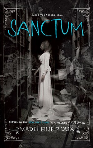
Thoughts: Just as creepy as the cover of the first book, so I think that's success? I really like the blue of the title, and how it stand out in contrast to the dark cover. The cover of the first book always interests my middle school students enough to pick it up out of my classroom library, so I will probably have to buy and add this one to my collection for them as well.
13. Don't Let Go by Michelle Gagnon - August 26
PERSEFoNE #3

Thoughts: This one is another one that's not horrible, but I'm still blah about. I think the colors make it a little dull, though I understand they decided to go with a different color scheme for each of the books in the series. I think the text of the title is annoyingly large, though I do like how the color changes on the author's name. The girl kind of looks like she's grabbing her own hair...ouch.
14. Deliverance by C.J. Redwine - August 26
Defiance #3

Thoughts: This cover would have actually been an acceptable one with a model if it weren't for the bridge going through her crotch. What were they thinking? A nice cover ruined by horrible image placement. That's pretty sad.
15. Feral by Holly Schindler - August 26

Thoughts: I feel like this is supposed to scare me, and it does a little..but only because I'm terrified of being in wooded type places by myself. I feel like that's pretty normal. She does seem to be just standing there though, while the tagline suggest that maybe she should be running. So there's that.
16. Undead with Benefits by Jeff Hart - August 26
Eat, Brains, Love #2

Thoughts: I LOVE this cover, just like I LOVED the cover of the first book. Yup, well done.
17. The Far Dawn by Kevin Emerson - August 26
The Atlanteans #3

Thoughts: Oh, look at the models...they look so..bored. I bet they get together, because that's what happens in books that have couples like this on the cover, right? Clearly I'm not a fan. I also don't like the border on the left side that does not seem to belong at all. It's good point? It matches the covers of the rest of the series.
18. Rumble by Ellen Hopkins - August 26

Thoughts: I have heard such great things about Ellen Hopkins' books, though I have yet to read any. Based on what I've heard and the issues she covers, I don't think I have any right to judge her covers. They're simple, and that's okay because what's inside is not. That is all. (Also, I love the colors).
19. Chasing Before by Lenore Appelhans - August 26
The Memory Chronicles #2

Thoughts: How does one chase before when it's already past? Hmm. Also, I hate the random spots, like the one that is right on her head. What is the actual point of that? It looks like it was thrown together without much thought, and it certainly does not make me want to pick up the book.
20. Maid of Deception by Jennifer McGowan - August 26
Maids of Honor #2

Thoughts: Nope.
21. Play Me Backwards by Adam Selzer - August 26

Thoughts: I think that I could probably design this cover...It seems completely random and not thought out much. Perhaps it will make more sense once the book is read, but I doubt that I will do that anytime soon.
22. Into the Grey by Celine Kiernan - August 26

Thoughts: Simple Illustration. Cool font. I'm digging it. I want this on my shelf ASAP.
23. Amity by Micol Ostow - August 26

Thoughts: THE HOUSE IS BLEEDING! This is completely awesome and well done, and I am sure that it would completely terrify me if I chose to read it.
24. A Little Something Different by Sandy Hall - August 26

Thoughts: I have an ARC of this book, and while it has part of this cover on it, it doesn't look nearly as awesome as this does. It does have enough for me to know that I am completely in love with this cover, though. Even though I have already read and reviewed this, I plan to add it to my shelf because of this beautifully illustrated cover.
25. One Death, Nine Stories by Multiple Authors - August 26

Thoughts: The picture definitely makes sense based on the title and synopsis of the book. I would be a little concerned about my middle school students reading so many stories about death, but it would probably be an interesting read for upper level YA readers.
26. YOLO by Lauren Myracle - August 26
Internet Girls #4

Thoughts: I always think that these covers are so cute. They are simple, sure, but they follow along with the idea of the book, and that is important to. It matches the rest of the books in the series as well, which is always a solid plus.
Poll: There we have it, those are the majority of the young adult books releasing this week. Which cover is your favorite of the week? Seeing as there are SO many books this week, I'm not going to create the poll as usual. Instead, simply leave a comment telling me your favorite cover this week and we can discuss them! :]


No comments:
Post a Comment